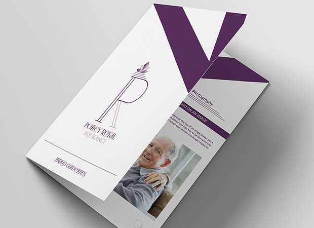
A vibrant modern perspective on a heritage brand
We were asked by a well-known insurance broker to design and develop a fresh, new rebranding concept for their business. The brief was to maintain the companies air of heritage and trustworthiness, but to invigorate the brand with a dynamic, modern logo and brand design.
Our Rebranding Highlights:
Modern Logo: Our new logo embodies the essence of a modern, forward-thinking insurance company. Its clean lines and sophisticated design speak to their commitment to staying at the forefront of the industry, but also reflects to the company’s heritage and pedigree.
Vibrant Color Palette: We’ve carefully chosen a fresh color palette that radiates energy and confidence. These colors represent our dedication to providing vibrant, tailored insurance and financial solutions.
Elegant Fonts: The selection of fonts in our rebranding reflects our professionalism and dedication to clarity.
Captivating Icons: Our new icons are not only visually pleasing but also convey the comprehensive range of insurance services offered. They signify a dedication to safeguarding their clients’ interests.
Brand Guidelines: We’ve established a robust set of brand guidelines to ensure consistency and coherence across all communication channels. Ensures that thier commitment to excellence shines through every interaction.
Branded Company Stationery: Our suite of branded company stationery, including letterheads, compliment slips, and business cards, carries the essence of the new brand and make a lasting impression with every touchpoint.
Marketing Materials: Our printed and digital marketing materials, including flyers, brochures, presentation templates, and website design concepts, showcase the adaptability and contemporary nature of the brand.
We believe that our rebranding concept will not only enhance the visual identity of the business, but also elevate customers experience with Policy Royal Insurance.


