LOGO DESIGN AND BRAND Identity
We were given the task of redesigning the logo for the Civil Service Awards but needed to keep the styling and design within the boundaries and framework of A Modern Civil Service.
For the logo design, we used the primary and secondary colours that represent the three pillars of A Modern Civil Service to form a simple star structure. The star symbolises the awards, but it also symbolises the collaboration of everyone in the Civil Service so that when they come together, they form something great and they achieve amazing things. The star is tilting to the right with a dark green arrow in its centre, giving the idea and feeling of movement – pointing toward the sky, it’s shooting up, always aiming for greater things. The star is a classic and well-known symbol of achievement across many countries and cultures. We felt this form worked well as a symbol to represent the awards. It stands well on its own by holding the classic palette of AMCS, making it recognisable but also usable on its own as an icon.
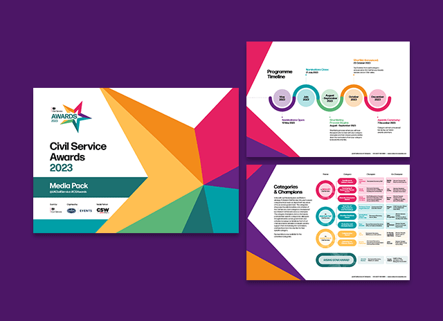
We kept the brand styling very similar to Civil Service Live, but instead of using the Venn diagram as the core design throughout the branding, we used the 5 pointed star of the new logo. This shape can be seen framing the photography and text and is used as a background texture which can be seen in the media pack pages shown here.