The Project
We embarked on a creative journey to craft a brand identity that perfectly encapsulates the essence of our client’s business: amazing smoothy varieties, using only the freshest and healthiest of ingredients, provided by a fun, laid back and welcoming company.
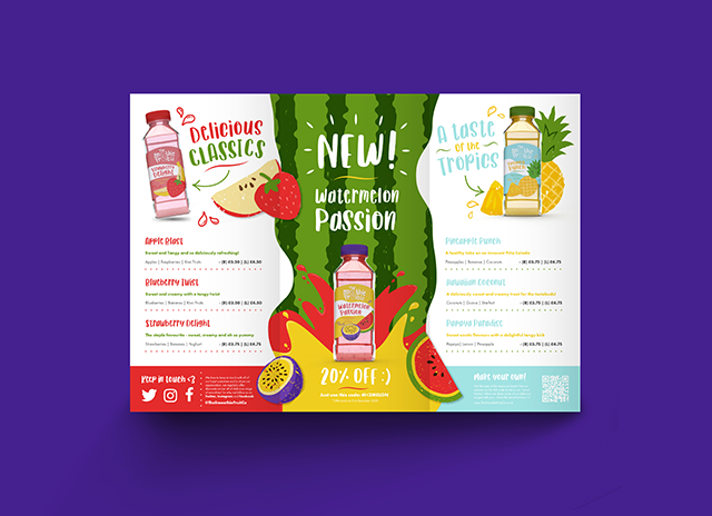
We created their company logo keeping these thoughts in for front of our minds – we wanted to find a way to show all those aspects; what they do and provide but also the culture and vibe of the company that create these delicious smoothies. We got to work creating a fun and vibrant logo design, turning the ‘O’s of ‘Smoothie’ into pieces of fruit that were falling into the ‘U’ of ‘Fruit’, which transformed into a glass. We gave the logo a roughened, speckled texture to highlight the natural and fresh ingredients used in the smoothies. We wanted to draw inspiration from nature’s own palette and pay further homage to the diverse range of fresh fruit ingredients used in our client’s smoothie concoctions by creating a bold and striking colour palette – each colour representing a fresh ingredient in their smoothies.
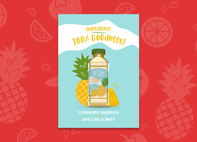
Because nature is rarely perfect in structure and form, we wanted to embrace this in our choice of illustrations by adding the same roughened and speckled effects used in the logo to the fruit illustrations supporting the brand. We created a fun and stylised illustration style for the fruit and characters of the brand, echoing the laid-back and happy nature of The Smoothie Fruit Co.
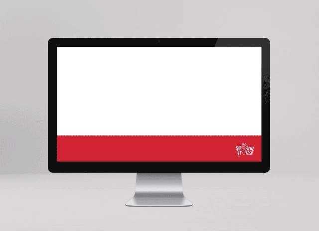
As well as creating the brand identity for The Smoothie Fruit Co, we also crafted them a plethora of brand collateral – one of those items being an interactive PowerPoint presentation, a sample of which can be seen below. Our client wanted to create an interactive presentation to use on their pop-up smoothie stand as a way to engage, educate and entice their customers to their variety of smoothies. We created a fun and animated interactive presentation – the intro screen showed their new individual bottled range, that when each bottle was pressed on, took the audience on a journey of learning about the health benefits of each smoothie. We made the presentation so that the viewer could easily navigate around the document – hopping seamlessly from one product to another.